Mobile Homepage

Redesigned Brella's mobile app from a basic networking tool into a comprehensive event platform that helped the company survive the post-COVID shift and win major clients.

Mobile Homepage - App interface showing new design

CHALLENGE

Mobile app was neglected during COVID pivot, becoming a liability in sales cycles as event organizers demanded mobile-first experiences post COVID.

OUTCOME

Created homepage and design system that impressed prospects, secured key clients, and positioned Brella as industry leader in mobile event tech.

Context

Brella was originally an event app. But in 2020, when Covid hit, we pivoted from a networking app to a full event platform. We focused our resources on building a robust web experience since everyone was attending from their laptops.

By late 2022, as events returned to in-person, organizers needed mobile apps that matched the web quality they'd experienced during COVID. Our sales team kept hearing: "Your web platform is impressive, but the mobile app isn't up to date."

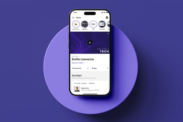
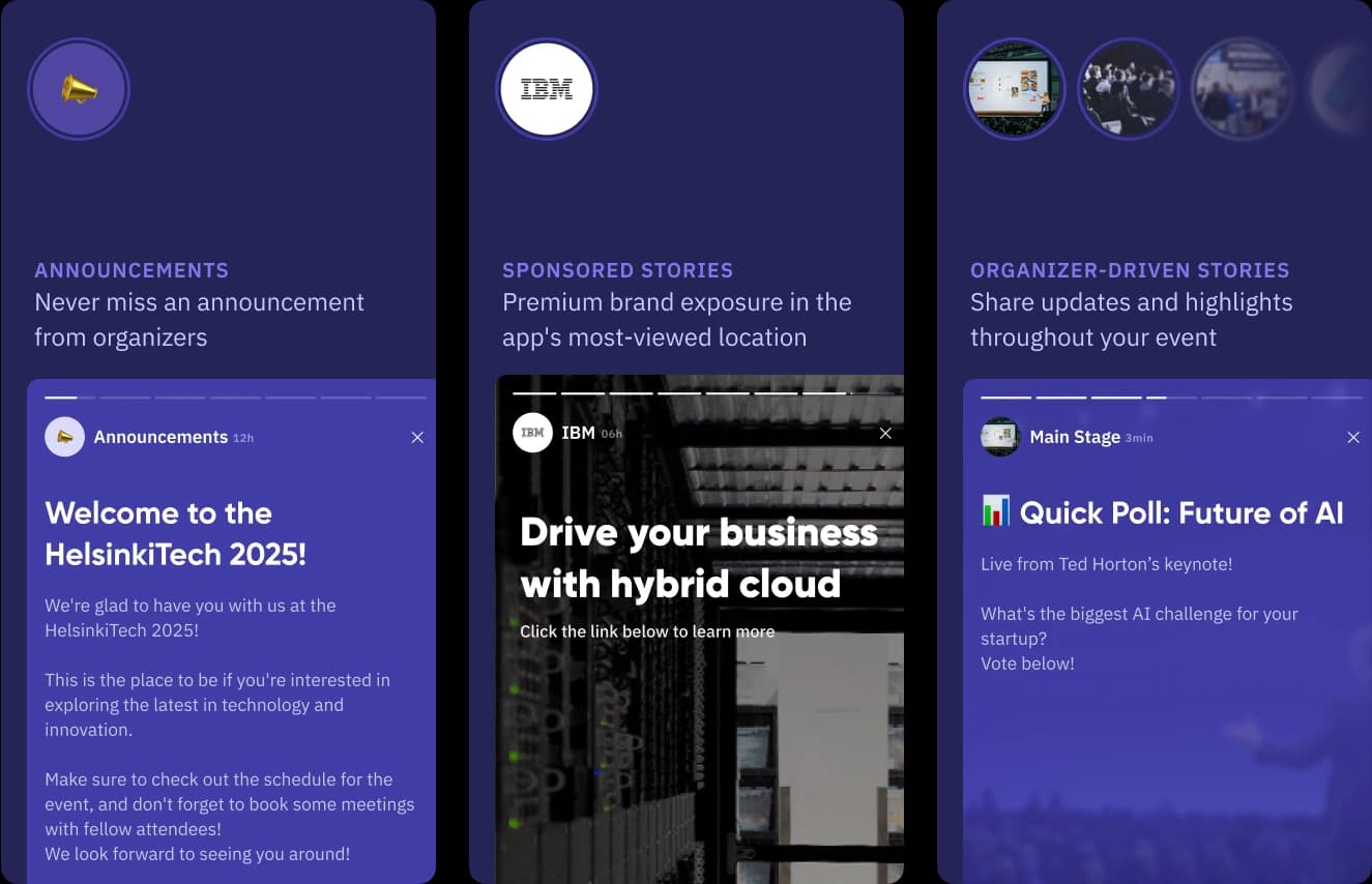
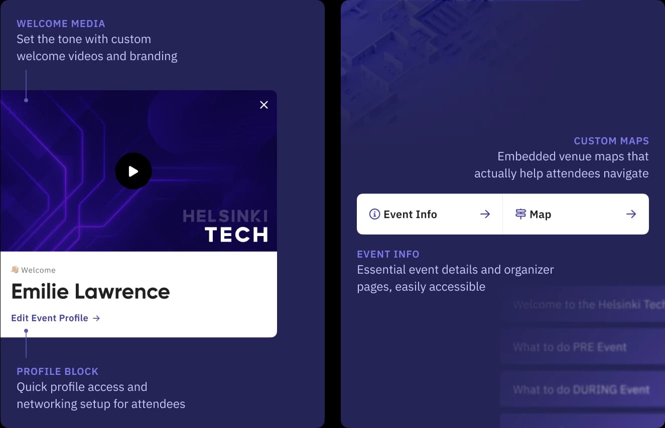
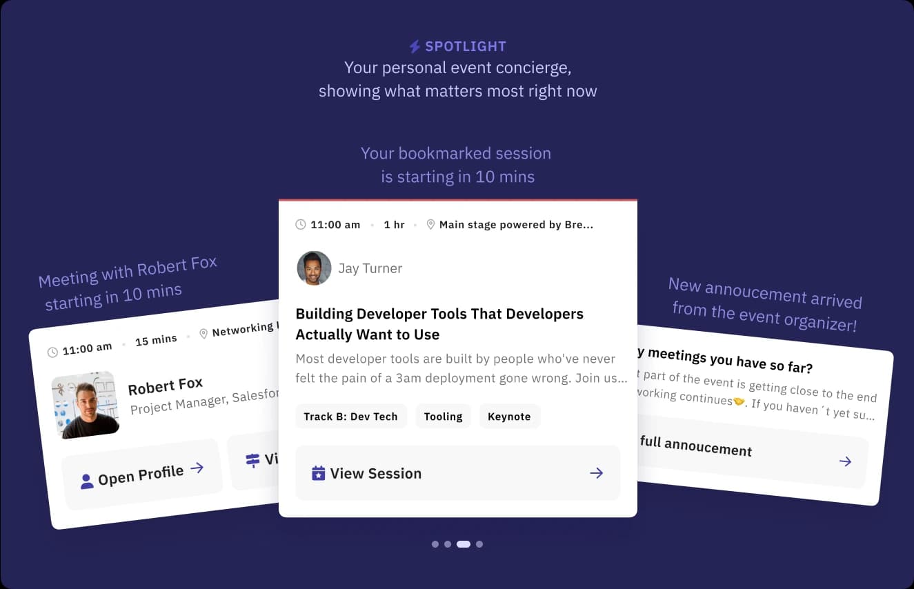
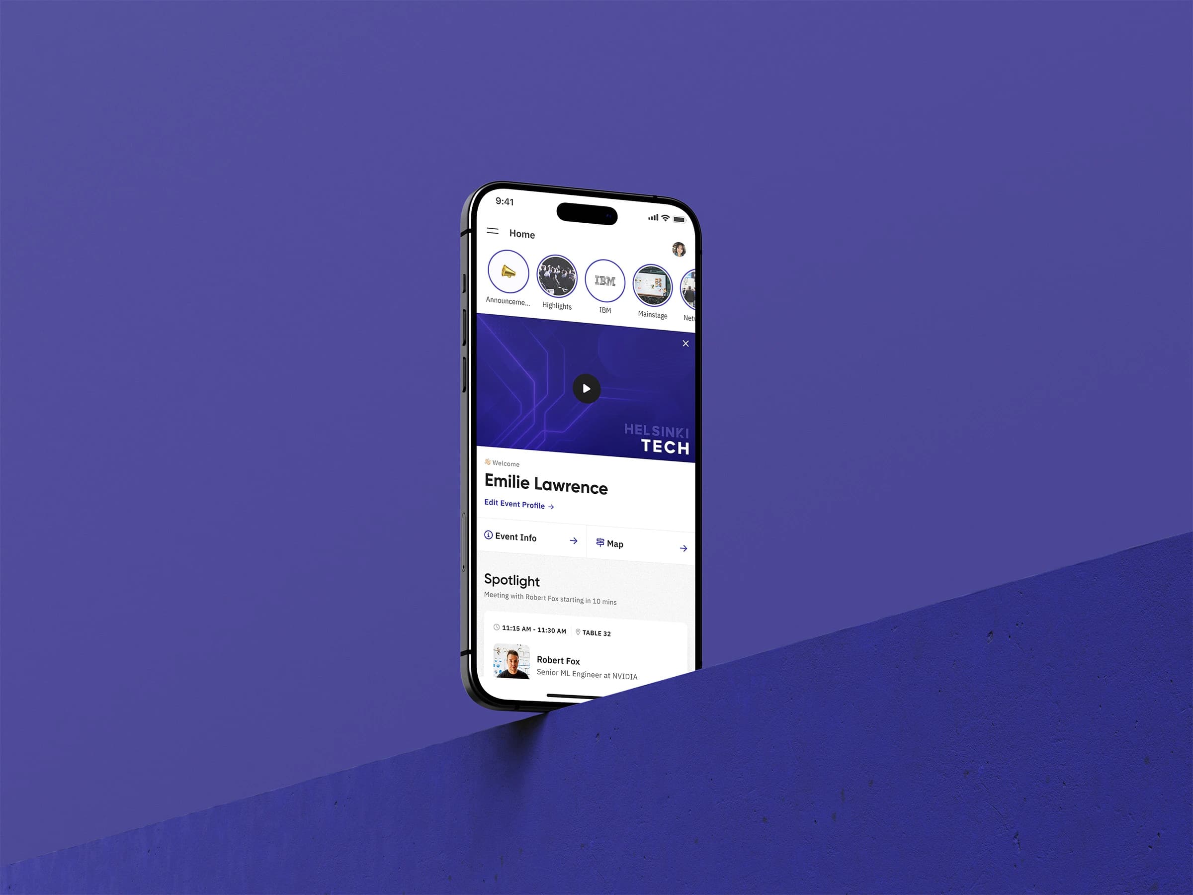
The missing homepage became our biggest deal-breaker.
Our app opened directly to a people list (which worked perfectly in networking-app days), but that isn't exactly the wow factor you want your attendees to feel when they are welcomed to the event.

Understanding the problem

We started with the question toddlers, designers, and Backstreet Boys love to ask: "Tell me why?"
The business was asking for a homepage feature, but it felt like we needed one just because competitors had it. So we dug deeper to understand the actual human problems.

Research approach:

  • Desk research through feedback boards and closed-lost reasons
  • Sales call recordings from Gong
  • Stakeholder interviews for qualitative research.

Key Insights:

  • Organizers returning to in-person events expected mobile apps to match web quality
  • Missing "wow factor" on mobile app was costing us deals.
  • A major sales cycle approaching where enterprise organizers would lock-in the vendors for that cycle.
  • Sponsor monetization features were buried on mobile, making it harder for organizers to secure event funding
  • Technical bonus to modernize our stack (outdated React Native navigation, no design tokens)

Competitor Analysis

We analyzed competitor apps to understand what we were up against.

Key Insights:

  • Event industry design feels stuck in 2014
  • Homepages were basic navigation hubs, not contextual experiences
  • Apps felt like features were added because business asked, not because users needed them
  • Massive opportunity to stand out and impress organizers

Competitors researched:

Most funded company in the marketMost promient EU competitorOther so called modern

STATE OF COMPETITORS THEN

Opportunities

Synthesising research led to generating opportunity to each stakeholder involved in the project and this became a huge win-win for all.

For Brella

Stand out as the best mobile event experience in an outdated industry

For Event Organisers

Create impressive events that retain sponsors and delight attendees

For Event Sponsors

Better monetization opportunities - qualitative (targeted leads and meetings) or quantitative (maximum brand exposure and awareness)

For Product team

Pay tech & design debt & lay foundations for bigger projects

Solution

Instead of one static homepage for everyone, I designed a modular system that adapts to different users and moments. The goal was to come true on all opportunities stated above and achieve a good win-win for all.

brella homepage mockup

Figma prototype for demo

Its hard to understand in a prototype what we made, so lets break it down module by module and we can see who it helped and how.

Stories

Module

Event apps typically show announcements as boring cards or notifications that people ignore. We asked ourselves: how do we make crucial event information feel fresh and engaging?

The solution:

Instagram-style stories. Attendees already know this pattern from social media, so they'd naturally check for updates.

What this unlocked:

  • Announcements got prime location and people found an intersting way to read/ discover them
  • Organizers could embed links for real-time surveys during sessions
  • Multi-track events could organize updates by track, not just one chaotic feed
  • Sponsors got prime real estate for quantitative exposure at the top of the app

The result:

Event communication went from forgettable notifications to an engaging experience that people actually wanted to check.

Preview of Stories feature

Welcome Media

Module

We noticed that most event apps dump people straight into navigation menus with zero context. Imagine walking into a conference and immediately being handed a schedule without anyone saying hello or telling you where you are.

The solution:

We created a proper welcome experience that actually welcomes people.

Organizers could add custom welcome videos to set the tone, embed venue maps so people know where they're going, and we made profile editing accessible right from the homepage because inevitably someone needs to update their info. Everything essential gets organized in clean tabs - Event Info and Map - so it's there when you need it but not cluttering the experience.

The result:

Opening the app finally felt like arriving at a well-organized event, not getting lost in a digital maze.

Preview of Welcome feature

Spotlight

Module

Most event apps treat every moment the same - whether you're rushing to a meeting or casually browsing between sessions, you get the same static information. We thought that was backwards.

The solution:

We built a smart module that works like a personal concierge, showing you exactly what needs your attention in the next 10 minutes.

The Spotlight module intelligently displays different cards based on what's coming up: if you have a meeting starting in 10 minutes, that's the card you see. Got a bookmarked session about to begin? That card appears instead. Fresh announcement from organizers? It gets priority for 10 minutes then gracefully steps aside. When there's nothing urgent happening, the module simply hides itself rather than showing irrelevant content.

The result:

Attendees always knew what to focus on next, like having a helpful assistant constantly keeping them on track throughout the event.

Preview of Spotlight feature

Serendipitous Networking

Module

Brella's AI matching was already our strongest moat as a product, but it lived primarily in the dedicated People tab. We saw an opportunity to make this strength even more powerful.

The solution:

We brought a taste of our networking magic directly to the homepage, but designed specifically for serendipitous discovery rather than advanced search.

This wasn't meant to replace the robust networking tools in the People tab - those stayed for serious meeting planning. Instead, we created a playful space for pre-event discovery. When attendees were setting up profiles or casually browsing, they'd encounter interesting people they might never have found through traditional filtered searches. The shuffle button gamified the experience, letting users discover unexpected but relevant connections.

The result:

Our networking moat became even stronger. Users discovered valuable connections they would have missed through conventional search, all while staying on the homepage. It turned profile setup time into productive networking time.

Preview of Networking feature

Sponsor Representatives

Module

We'd always had sponsor ads with display share settings, but showing traditional banner ads on the homepage felt like those cluttered web pages from the early 2000s. Nobody wants to see ads, and our research showed sponsors were struggling to get qualitative meetings.

The solution:

We took the networking module we'd just built and gave it a sponsor twist. Instead of showing matchmaking results, we displayed sponsor representatives based on the organizer's display share settings.

The beauty was in the execution - users saw real people they could connect with, not promotional banners. Sponsors got qualified meeting opportunities instead of just eyeball metrics. The shuffle button respected the display share ratios (if Amazon had 50% share, Google 30%, and Microsoft 20%, shuffling would show Amazon reps 5 out of 10 times) while randomly selecting different representatives each time. Organizers could sell this as a premium networking opportunity rather than just "ad space."

The result:

Sponsors finally got the qualitative engagement they needed, attendees discovered valuable industry connections, organisers could sell more and nobody felt like they were being advertised to. Win-win-win.

Preview of Sponsor feature

Speakers

Module

Most event apps buried keynote speakers deep in session schedules, making it nearly impossible for attendees to discover the industry leaders they'd actually want to connect with. We thought star speakers deserved better visibility.

The solution:

We created a dedicated spotlight section showcasing the top 5 star speakers as chosen and ordered by event organizers.

The result:

Star speakers got the recognition they deserved, attendees could quickly find industry experts they wanted to learn from, and organizers had another tool to showcase the caliber of their events.

Customer Validation & Iteration

During the wireframe and visual design process, we conducted multiple customer calls to showcase what we were building and get early feedback. The response was overwhelmingly positive - customers were excited about the approach and could immediately see how it would solve their problems.

This validation gave us confidence we were on the right track and helped refine details before development began.

Implementation & Collaboration

Working with our engineering team, we had to solve some interesting technical challenges. The modular system needed to be flexible enough for different event types while maintaining performance on mobile devices.

Handoff process included:

  • Detailed developer specifications and technical requirements
  • Sales presentation deck with interactive mockups for demos
  • Marketing asset packages with mockups and promotional images

We leveraged this project to modernize our React Native navigation (which was 2 versions behind) and implement our first design token system in the mobile app.

This homepage project directly enabled our design token system that would later power white-labeling capabilities.

Wins

Business wins:

  • DMG Events (Blackbelt): Major enterprise deal closed
  • Financial Times: Significant deal pipeline opened
  • ALM Media: Enterprise client secured
  • Featured on Event Tech Live as industry innovation

Thank you guys that was genuinely, and I'm not just saying that it was actually quite… different and refreshing and I think you guys have got something we’re sold on.

- Jamie Burton, Marketing Director, DMG Events

This was especially meaningful coming from a target customer seeing our homepage work for the first time during the demo.

Strategic Impact:

We created a dedicated spotlight section showcasing the top 5 star speakers as chosen and ordered by event organizers.